The Color of 2026 Is White — and That Is Not a Neutral Choice
White as the Color of 2026 reflects how restraint, neutrality, and control increasingly shape contemporary art and its institutions.


Pantone’s decision to name Cloud Dancer, a pure white hue, as the Color of the Year for 2026 arrives not as a visual climax but as a reduction. After years of emotionally expressive selections—colors designed to signal resilience, warmth, or collective feeling—white represents a withdrawal from saturation rather than an escalation of it. The choice has been framed as calm, clarity, or reset, but its significance lies less in symbolism than in timing. White appears at a moment when cultural systems are increasingly organized around restraint, legibility, and risk management.
White has never functioned simply as absence. In art history, it has been used to strip meaning down to structure: Malevich’s White on White, minimalist sculpture, conceptual installation, modernist architecture. Again and again, white has operated as a way of foregrounding conditions rather than content—space, light, material, scale. What Pantone elevates in 2026 is not a color that speaks loudly, but one that exposes what surrounds it.
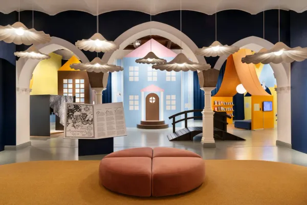
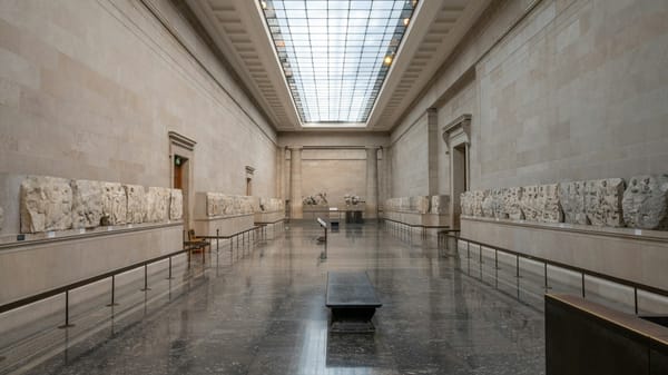
This exposure is not innocent. White is already the dominant condition of contemporary display. The white cube remains the default architecture of legitimacy, the background against which meaning is staged and controlled. To elevate white to the status of protagonist is therefore not to introduce something unfamiliar, but to make explicit what has long structured visibility while remaining unmarked.
What makes Cloud Dancer divisive is not its subtlety, but its refusal to perform affect. White does not reassure in the way warm tones do, nor does it provoke in the way saturated colors can. It resists instant interpretation. In a cultural economy increasingly organized around immediate legibility, this resistance is read by some as emptiness and by others as discipline. The disagreement is less about color than about tolerance for restraint.
For institutions, white aligns easily with prevailing operational logics. It photographs cleanly, scales across formats, and avoids cultural specificity that might complicate interpretation. It supports a language of neutrality that institutions already rely on when navigating political sensitivity, funding scrutiny, and public accountability. In this sense, white does not interrupt institutional habits; it mirrors them.
For artists, however, white presents a more demanding condition. It removes the protection of excess. Texture, surface, proportion, and material choice become immediately visible. So do hesitation and indecision. White amplifies precision and exposes failure. It offers no spectacle to hide behind, no emotional shorthand to lean on. To work seriously with white requires commitment rather than gesture.
This is where the choice becomes less aesthetic than structural. White asks whether contemporary art systems—artists, curators, institutions—are willing to operate without the insurance of saturation. It tests whether meaning can emerge from controlled conditions rather than accumulation, and whether presence can be asserted without visual insistence.
The risk often attributed to white—that it flattens emotion or erases context—is real, but it is not inherent. White does not neutralize by default; it neutralizes when treated as safe. When deployed without intention, it disappears. When used with precision, it sharpens attention and concentrates responsibility. There is nowhere else for meaning to go.
Pantone’s choice does not force artists or institutions to work with white. It signals, however, that restraint itself has become legible as a cultural value. At a moment when systems across the art world favor early alignment, procedural clarity, and defensible decisions, white reads less like a retreat than a reflection of how power is currently organized: quiet, infrastructural, and difficult to contest because it rarely announces itself.
In this sense, Cloud Dancer functions less as a trend than as a diagnostic. It reveals a preference for conditions that minimize friction while maximizing control, for environments in which meaning is carefully modulated rather than asserted. Whether this results in rigor or in caution depends entirely on how white is activated.
By the time exhibitions open in 2026, white will not appear new. It will appear familiar, even inevitable. What matters is not whether white dominates the visual field, but whether it is treated as background or as structure. The difference is decisive. White can either conceal how decisions are made, or make those conditions impossible to ignore.
The color of 2026 is white not because it says nothing, but because it demands that everything else be accounted for.
© ART Walkway 2025. All Rights Reserved.