Color of 2026: Why Pantone’s White Divides the Art World
Pantone names white as the Color of 2026. Cloud Dancer sparks debate across contemporary art, design, and visual culture.

“Pantone’s Color of 2026 is white — and the art world is divided.”
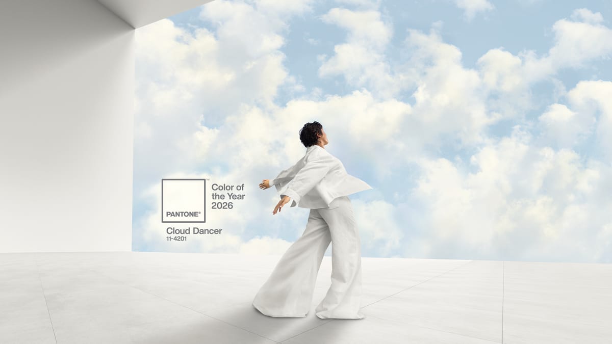
By selecting PANTONE 11-4201 Cloud Dancer, a near-pure white, as its Color of the Year for 2026, Pantone has made one of the most restrained — and provocative — choices in the program’s history.
For more than twenty years, the Pantone Color of the Year has operated as a cultural signal across fashion, design, branding, and contemporary art. Recent selections leaned into emotion and immediacy. Peach Fuzz (2024) emphasized intensity and confidence. Mocha Mousse (2025) signaled comfort, warmth, and grounding.
Cloud Dancer does neither. It does not perform emotion. It withdraws from it.
In a visual culture defined by saturation, speed, and constant stimulation, Pantone’s Color of 2026 reads less like a trend forecast and more like a deliberate interruption.
Why Pantone Chose White as the Color of 2026
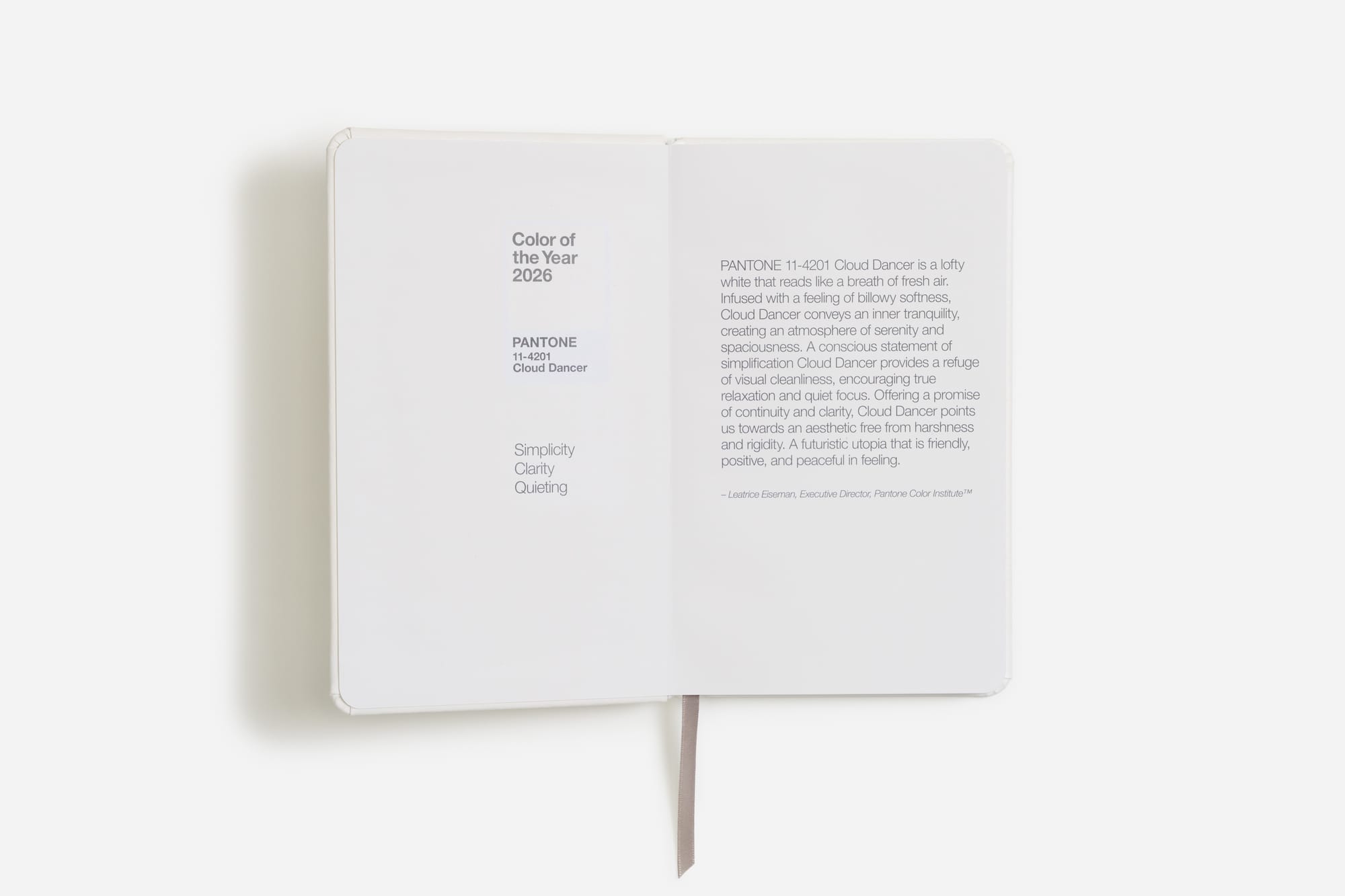
Pantone describes Cloud Dancer as “a whisper of calm and peace in a noisy world.” The language is intentional. This is not white as absence, but white as relief.
Leatrice Eiseman, Executive Director of the Pantone Color Institute, frames the decision as a response to overload. Cloud Dancer, she says, is “a discrete white hue offering a promise of clarity” — a “conscious statement of simplification” at a time when distraction has become constant.
Laurie Pressman, Vice President of the Pantone Color Institute, positions the color as a threshold rather than an endpoint. Cloud Dancer represents a “liminal space,” balancing “our digital future and our primal need for human connection.”
Taken together, Pantone’s rationale is clear: the Color of 2026 is not meant to dominate attention, but to create space for it.

White in Art History Has Never Been Neutral
Supporters of the decision argue that white has never been empty. In art history, white has functioned as light, silence, reduction, and potential.
From Kazimir Malevich’s White on White to postwar minimalism, conceptual art, and contemporary architecture, white has repeatedly been used to strip meaning down to its core. Rather than erasing content, it intensifies scrutiny. Surface, scale, material, and imperfection become unavoidable.
In this lineage, Cloud Dancer can be read not as a lack of color, but as an invitation to intention. White removes excess. It exposes hesitation. It forces decisions to matter.
Why the Color of 2026 Makes Artists Uneasy
Critics, however, question whether white can sustain the narrative weight required of a Color of the Year.
In galleries, white already dominates as infrastructure: the white cube, the neutral wall, the assumed void against which art is displayed. Elevating white from background to protagonist demands exceptional sensitivity. Used without rigor, it risks becoming passive — a default rather than a position.
For artists, the challenge is acute. How does one activate white so that it speaks — politically, emotionally, materially — rather than recede? How does white avoid flattening cultural specificity or disappearing into neutrality?
In this sense, discomfort around Cloud Dancer is not purely aesthetic. It is structural. White offers no cover. It punishes indecision. There is nowhere to hide.
Cloud Dancer as a Test for Contemporary Art
Cloud Dancer forces an uncomfortable but timely question: what remains when color is reduced to its most minimal expression?
Is contemporary art confident enough to work with restraint? Can meaning emerge from subtlety rather than spectacle? Can silence compete with saturation?
Pantone’s Color of 2026 reframes white not as a safe choice, but as a test — one that challenges artists, curators, and institutions to reconsider presence, absence, and visual responsibility. It quietly resists the logic of instant impact and algorithmic appeal. It slows the viewer down. It asks for patience.
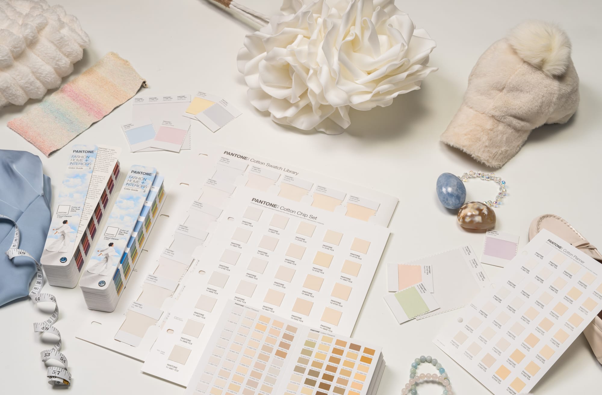
From Concept to Commerce: How Pantone Will Use Cloud Dancer
Importantly, Cloud Dancer is not only a philosophical gesture. It is also a platform.
Pantone has announced a year-long creative initiative built around Cloud Dancer, commissioning artists across disciplines to produce original interpretations of the color. The first collaboration launches with illustrator and visual artist Emiliano Ponzi, whose limited-edition tote bag translates the hue into graphic form.
At the same time, Cloud Dancer is already embedded in Pantone’s licensing ecosystem. Partners include Motorola, which is releasing a special edition Edge 70 device in the Color of the Year, and Post-it, which will introduce Cloud Dancer as the centerpiece of its 2026 Neutrality Collection. Hospitality group Mandarin Oriental is also participating, integrating the color into experiences across its global properties.
The message is clear: even restraint can be scaled.
How Artists and Curators Can Respond to the Color of 2026
Whether Cloud Dancer proves inspiring or frustrating depends entirely on how it is used.
For artists, the Color of 2026 opens a space for experimentation:
white as material, white as light, white as political surface, white as silence, white as resistance.
For curators and institutions, it presents an opportunity to rethink exhibition design and visual storytelling beyond chromatic intensity. White becomes not a neutral container, but an active agent.
For audiences, it offers a different mode of engagement — one that rewards slowness, close observation, and gradual meaning rather than immediate impact.
What the Color of 2026 Ultimately Asks
The question is no longer whether white can be more than a background.
The question is whether we are willing to let it lead.
As the Color of 2026, Cloud Dancer does not demand attention. It tests it. It asks what remains when spectacle falls away — and whether contemporary art is prepared to answer with restraint instead of noise.
How will you respond to a year defined by reduction, openness, and possibility?
© ART Walkway 2025. All Rights Reserved.